
DESIGN
Muse: Digital Music Player
Skills: Coding
Tools: Python/TkForge/VSCode/Figma/GitHub
Overview
While working at Squarespace, I was accepted into Code Camp; a month-long course that introduced me to basic coding, including HTML, Unix, Python, GitHub, VSCode and so much more. I was able to learn alongside Squarespace Engineers and utilize my skills during Hack Week.
Since the start of camp, I had the desire to design a digital music player. From making my very first music application to designing Muse, music is always the thread that connects my work. What inspired Muse was our current moment. In the digital age, we’re constantly consuming content. Whether it is attributed to doomscrolling on social media or reading headline after headline. I noticed that in resistance to this, there has been an uptick of people purchasing designated listening devices to depart from big streaming. Inspired by the nostalgia of the 90’s/Y2K, I decided to design Muse.
Process
I began this process by designing the UI of the music player in Figma. Since I created the design elements in Figma, I had to problem solve how I was going to code the different parts of the music player into actionable elements. For example, pressing the button to play the music or skip the song. I found a program known as TkForge that separated each element to allow me to code each action. Then, using VSCode, I installed Pygame and Tkinter to configure how to play the song and loop between two songs.
There were times that I ran into some bumps, which allowed me to figure out different ways to solve each problem. During those moments, I was able to collaborate with an Engineer on how to use Python and Pygame to queue a song, to a skip a song, change the song title, and loop between the two songs I chose. Once we figured out how to play a song by clicking the button, I was able to play a song using a local file. From there, we were able to bring Muse to life.
See the full demo below.

Muse Demo
Takeaways
Muse taught me so many lessons in the process. As my first time learning to how to code and building a music player from scratch, I learned that trial and error was super important. If I wasn’t able to get my code correct, I was able to try a different route or figure out an entirely different way on how to get the result I wanted. I found this thought process to be fascinating and challenging, it was a beautiful combination of my analytical and creative mind. Creating Muse was also such a fun and collaborative project. Coding really allowed me to use skills I already possessed, iterate on them further, and obtain an entirely new way of problem solving. Muse was the first step into my coding journey, and I’m so excited for what I’ll create next!
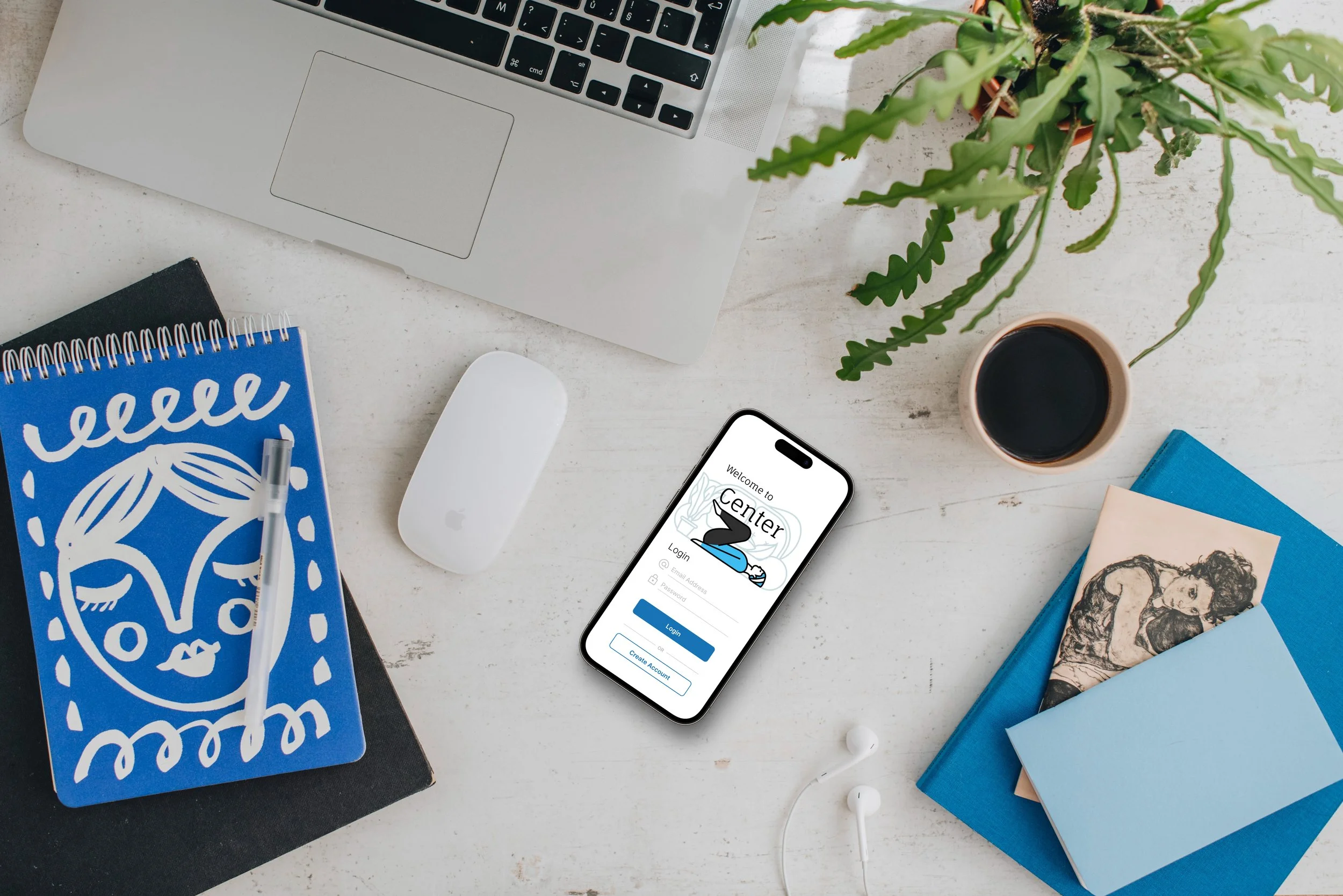
Center: An Emotion Tracker App
Skills: UX Design
Tools: AdobeXD/Figma
Overview
During my Google UX Design Course, I created an app called Center, as my final project. The goal of Center was to create a comprehensive solution for parents and children. For parents, Center helps track their child's emotional state, providing resources to better understand their child's development and offer helpful tips and activities to support their emotional wellbeing. Additionally, it provides access to informative articles and videos to help parents better understand their child's emotional development. For children, Center seeks to help children gain emotional awareness with personalized emotion tracking and daily check-ins. With Center, parents can monitor their child's progress and intervene when necessary, leading to better communication and a healthier emotional connection between parent and child.
Process
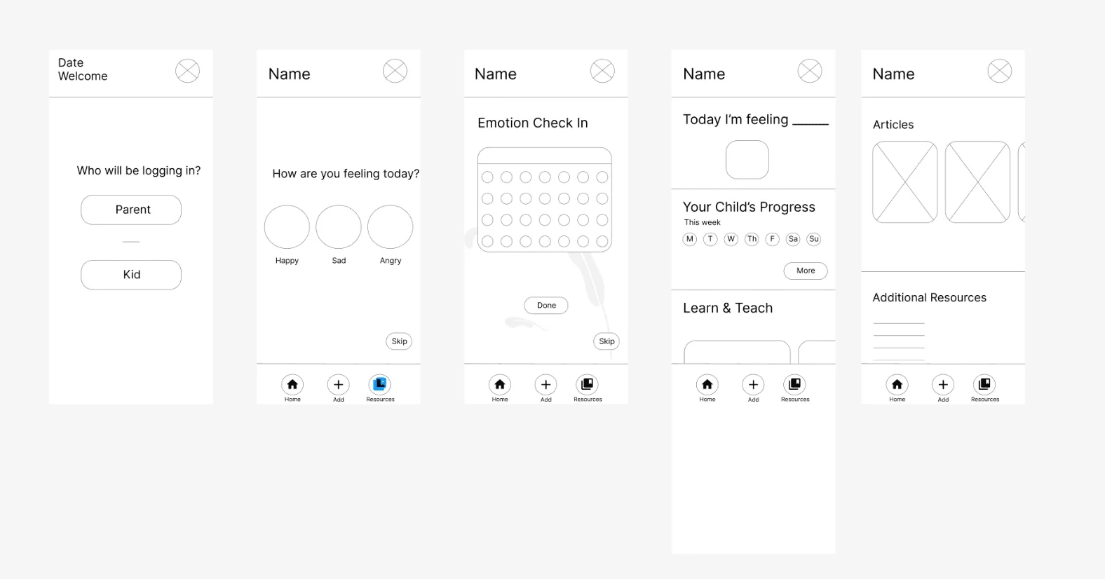
During the beginning stages, I completed a Competitive Audit to compare and contrast existing applications that served as emotion trackers. Next, to ideate, I performed rounds of the Crazy Eights exercise to generate multiple rapid sketches of potential app layouts and features. These sketches were used to spark creativity and explore various design possibilities quickly. Afterward, I created paper wireframes, mapping out the structure and layout of the app's main screens and features. The paper wireframes allowed for quick iterations and changes to the app's design based on feedback and testing. Overall, the ideation process was an essential step in the app's development, to explore different design ideas and create a solid foundation for the final product.
Wireframes & Prototypes
During the prototype stage, I sketched wireframes and then created digital wireframes to build on my low-fidelity prototype.
Feel free to check out my lo-fi prototypes in Adobe XD.
Testing
I performed two rounds of a moderated usability study with 5 participants. For my Key Performance Indicators (KPIs) I focused on Time on Task, User Error, and Conversion.


Results
After the usability studies and speaking with users, I received positive feedback regarding how the app functioned, completing tasks, and navigating through each prompt. Users shared that the app was really intuitive and had really fun activities for both parents and children to engage with in order to make progress towards emotional regulation and tracking good days and bad days.
Final Prototype
Takeaways
My main takeaways from this project include the importance of visual design and being very clear with what your goals are when starting an app from scratch. Throughout the research process, I had an idea of the direction I wanted to go in. However, after completing various activities, performing numerous sketches, and gaining substantial feedback, I was able to really zoom into what I wanted Center to look like and focus on. I was able to prepare how I wanted to build the app with the help of my competitive audit, researching similar resources and understanding how they functioned. Since I have experience creating more than one mobile app, I’ve learned how to do so more successfully now than before.
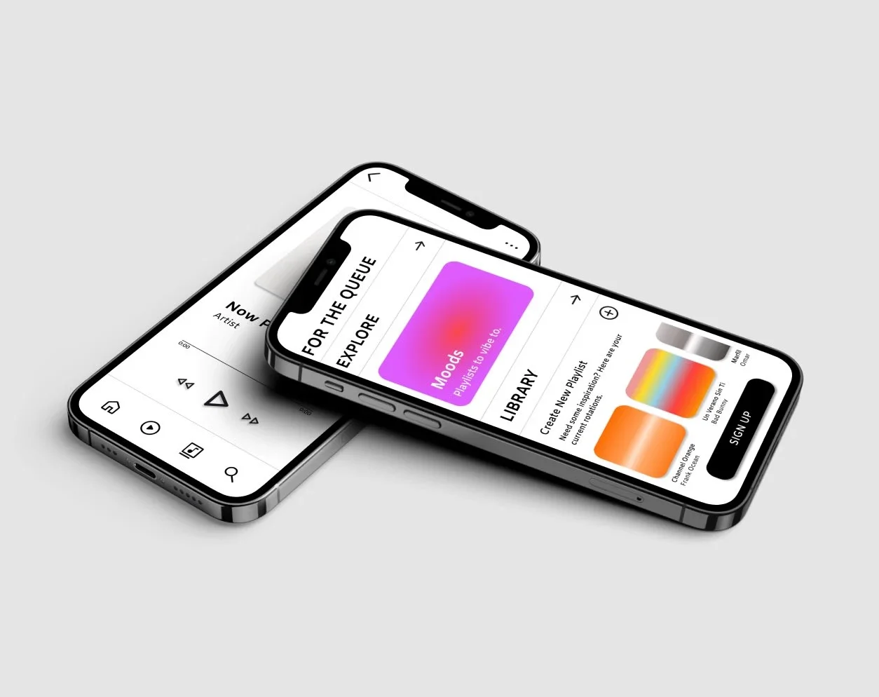
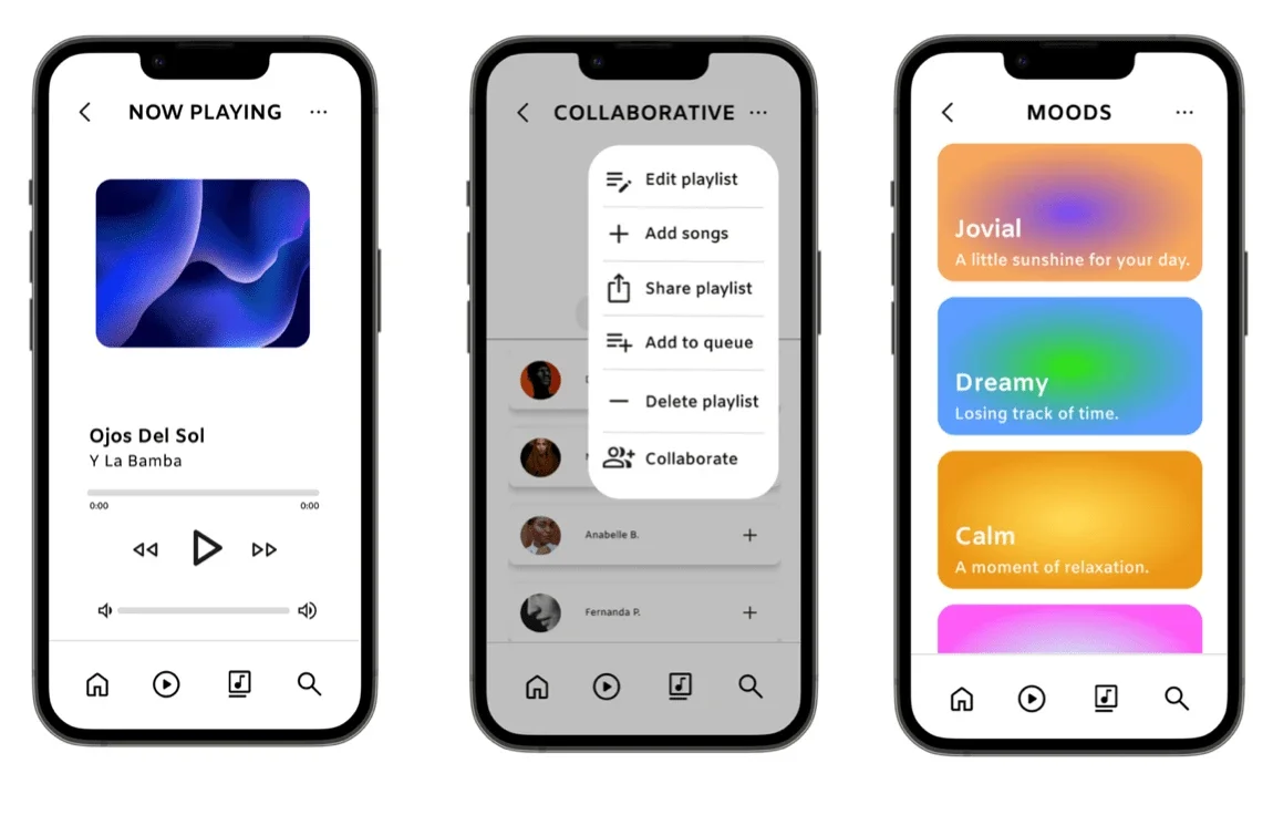
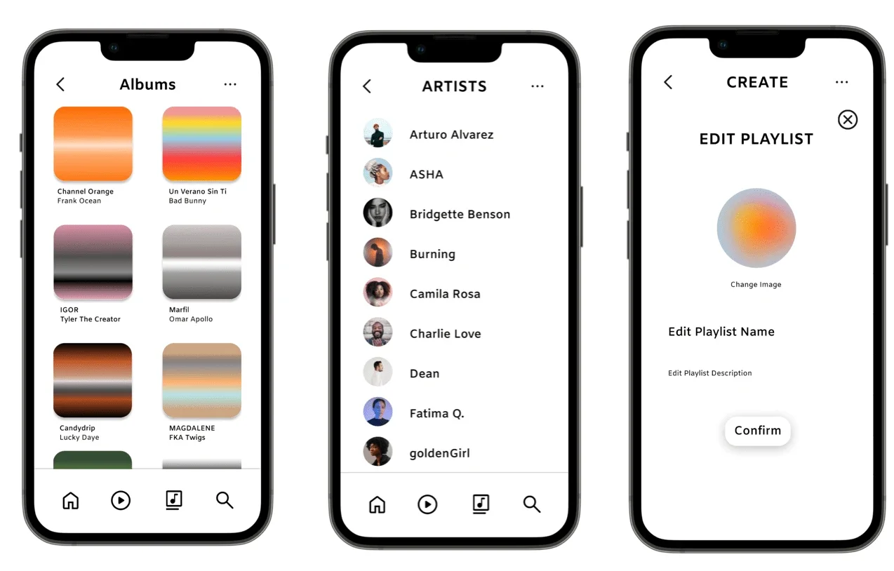
For The Queue: Music App
Skills: UX Design
Tools: Figma
Overview
My very first project in Google’s UX Design Course was For The Queue. I felt extremely passionate and drawn to the idea of designing my very own music app. As a user having subscribed to many music apps in the past, I noticed that some apps had features that I enjoyed but they didn’t quite exist in one app. More often than not, when I subscribed to one app, I was missing the qualities another one. Therefore, I began to ask the question of whether or not other users experienced this as well. Turns out, they did! Therefore, my goal was to design an app that struck a balance of sharing music socially and casual listening.
Some users enjoy the basic act of listening to music while others like the interactivity of sharing their playlists, being able to collaborate with other users, and personalize their music experience. Why not create an app that is a home for both?
Process
During the define stage, I organized a competitive audit to understand what the major differences are between large-scale music apps, including but not limited to Apple Music, Spotify, Soundcloud, and Youtube. Additionally, I created user journey maps, user personas, and identified problem statements to solidify what users could potentially be experiencing throughout their journeys. A primary user group identified through research was avid or casual music listeners that preferred a basic functioning app that acquired diverse features of music listening and sharing that co-exist on one app.
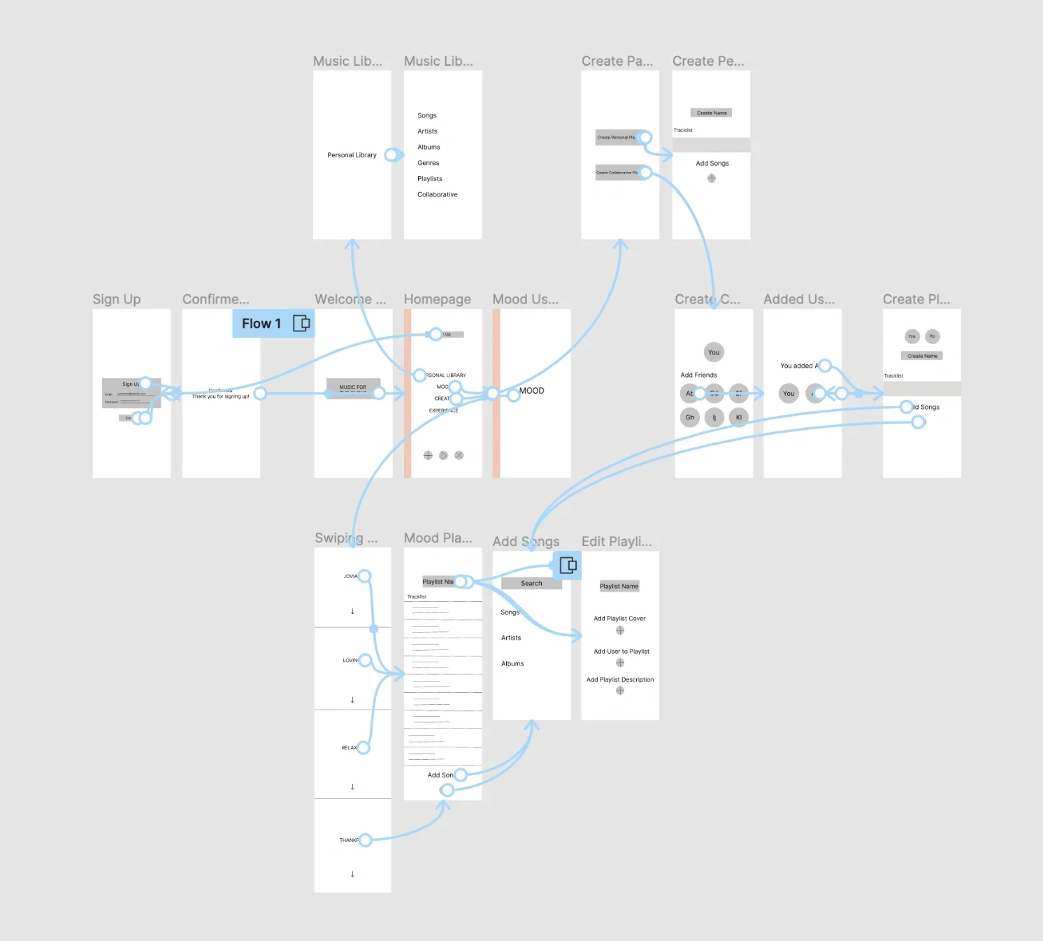
Wireframes & Prototypes
During the prototype stage, I sketched wireframes and then created digital wireframes to build on my low-fidelity prototype.
Testing
I performed two rounds of usability studies with 5 participants each round. I was able to identify what was lacking in the app, how to create more effective pathways, and personalization for the user experience.

Usability Study Findings
Round 1 - Low Fidelity
User needs a way to access a full music library.
User needs simpler and effective pathways, functioning back buttons.
User needs more ways to personalize their music so it can feel more unique.
Round 2 - High Fidelity*
Users find that having the sign up button on the bottom is more intuitive.
Users understand symbols more when pop ups define what it does.
Users would like to see more customization in the app’s theme.
*Notes from my second round of usability studies can be found here.
User Pain Points
Playlist Collaboration
Innovative Music Finding
Cross-Platform Sharing
Personalization & Interactivity
Results
Within the final renditions of For The Queue, I addressed user needs by enhancing creating more intuitive user pathways (E.g. a sign up and login pop-up when on the homepage of the app), adding accessibility to the same page by giving the user more than one option to get there, and allowing for users to navigate easily throughout the app user a navigation menu at the bottom.
Final Prototype
Takeaways
As the first application I designed, a major takeaway from this project was learning how much your ideas can change over time. I learned the importance of each step within the UX Design process, from iterating to usability studies. I understood why all of the facets of the design process are also crucial in creating responsive and accessible design. Even though every rendition of For The Queue was different from the last, this allowed me to start somewhere. While the music application isn’t perfect, I was able to put a lot of work into research and learn how UX design works which was a super valuable experience.
For The Queue also inspired my Playlist Collaborative series that I created to build community through music, check them out here if you’re interested!